Developing strategies. Designing experiences.
Let's step away from our computers for a moment and go for a quick, imaginary walk. I'll even let you pick where. The mall? A park? Downtown?
Take your pick, and then take a second and look around. I'll bet you can't make it 50 feet without running into someone using a mobile device of some kind.
You know what? I'll do you one better. I'll bet you about nine out of every 10 people you're seeing have one tucked away somewhere.
I'd say it's a pretty safe bet. According to the Pew Research Center's Internet and American Life Project, 85 percent of adults now own a mobile device and nearly 60 percent of them are using it to access the Internet. Over 30 percent have a tablet or e-reading device – with some demographic groups reporting close to 50 percent ownership.
For simplicity's sake, we won’t even get into how many American consumers own more than one device.
The point is, with that level of buy-in, it's likely that right now, one of your customers is looking at your traditional desktop website on a mobile device.
So ask yourself the following question: What is my customer seeing on a tablet or smartphone versus a competitor with a mobile or fully-responsive website?
Though they essentially serve the same purpose, websites built on a mobile or responsive framework operate in different ways:
A website built with a mobile framework is essentially a reset of an existing desktop website. It's a custom, separate website (m.yoursite.com or mobile.yoursite.com) designed to provide a user with a unique and optimized smartphone Web browsing experience.
A website built with a responsive code base is an existing desktop website but completely fluid, scaling on the fly as the browser window is adjusted and providing a user with an optimal viewing experience across a wide range of devices – from the biggest desktop computers to the smallest smartphones. In short, a responsive website responds to user control.
It depends. I know, not much of an answer, but it's the most straightforward and accurate. Why? Because a truly custom online solution is, well, custom. Unique. One-of-a-kind. Situational. A developer's preference on a specific framework should never outweigh the specific need of the client.
With that being said, it's time to consider ...
When you need consistency across multiple devices.
Let's revisit your customer, who's likely looking at your traditional desktop website on an iPhone 5. Or was it a Galaxy Note? An iPad? Amazon Kindle? Microsoft Surface?
Each of these devices has a different screen resolution – two, technically, if you consider both portrait and landscape layouts. Again, responsive designs are fluid. They allow a website to respond to the particular device accessing it, giving the user an optimized experience regardless of the platform. Screen resolution is irrelevant.
Consider these advantages as well:
Responsive Web design eliminates the need for a separate mobile presence, allowing the website owner to have a single site at a single URL with a single code base and set of files to be used. This makes a website significantly easier to maintain.
On June 6, 2012, Google officially said responsive Web design is its recommended configuration. As a website owner, this is what you want – the leading search engine telling you how to handle your mobile traffic. Remember, responsive Web design eliminates the need for a separate mobile presence. Using a single URL makes it easier for users to interact with, share and link to your content while helping Google's algorithms assign indexing properties for it.
In some circumstances, an existing desktop website can be converted into a responsive one. Unless your site has somehow grown to become a slow-loading elephant over the years, there's no need to completely rebuild something you're already committed to.
If defined, designed and developed correctly, a responsive website will generally load faster. Because a responsive designer or developer has to account for both desktop computers and limited-memory devices, the best responsive websites tend to be minimal builds with fewer interactive components that never need to be taken out of play. That means in terms of pure speed, they're the cheetahs of the World Wide Web.
Despite being a relatively new option for designers and developers, responsive frameworks are a great solution, and based on existing device technology, evolving Web standards and the stance of key industry players, may not be so much solution as standard practice in a few short years. Of course, that doesn’t mean anything to the customer viewing your site on a mobile device today. That doesn't mean anything to the client without the budget to potentially overhaul or completely rebuild an existing website today.
In short, tomorrow's solution doesn't always solve today's problem. That brings us to ...
When your site is heavily dependent on interactive components.
Not every company has an existing website that can provide a user with both an aesthetically-pleasing AND fully-functional experience on a mobile device. Complicated websites relying heavily on Adobe Flash animations or players, "light box" photo galleries and a number of other interactive components become borderline useless on a mobile device – most simply don’t support these elements or have the memory to run these efficiently even if they could.
Sure, a responsive code base can "hide" these elements at certain device screen widths, but the effect is somewhat deceiving. For example, while a responsive developer can prevent a homepage photo slideshow from displaying on a mobile device, there's nothing responsive coding can do to stop that slideshow from functioning – from loading the heavier backend code that makes this interactive element work. Simply put, preventing interactive elements from appearing on a device with responsive coding does nothing to prevent a complicated website from being complicated.
Again, tomorrow's solution doesn't always solve today's problem. You can't take an elephant and turn it into a cheetah. Sorry.
This is one benefit of a unique mobile website – it allows for a complete redesign, rebrand or repurpose of an existing Web presence. Because it relies on a separate code base and has a separate URL, a dedicated mobile website allows the owner to essentially "reset" the desktop version and repurpose some of the site's interactive elements while completely excluding others. This way, a website can truly become a customized mobile experience.
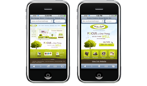
How Evolve Creative Group's desktop website (left) would appear on a smartphone if not for the cleaner, leaner mobile version.
Consider a few other benefits:
With a little backend coding, a user accessing your site with a smartphone can be automatically redirected to the mobile version of your desktop website. On paper, you'll have two URLs and two separate sites. On the Web, it will function as if you have one.
Since a mobile website is its own entity, you can streamline your content and avoid using additional code to hide or reposition excess elements. This allows for more control over your site's appearance on a smartphone with a limited-size viewport.
A mobile website is certainly a viable and well-tested solution, and depending on how your existing desktop site is built and your level of commitment to it, may be the best fit for you. If you've made a significant investment in an interactive, component-heavy desktop website and want to maximize return without completely shunning device users, then building a separate mobile site is probably the route you should take.
Regardless of the framework used to build it, a consumer's first experience with your website may be the first time a consumer experiences your brand. Take advantage of that opportunity – regardless of the device. Don't let your first impression become the last one.
Kiersten Traboulsi, Creative Director at Evolve Marketing, explains what a wireframe is and why it's important to make one before designing a website. She'll review three main benefits of wireframing as well as some best practices to consider. By the end of this video you'll know what a wireframe is, what it looks like and why you should create one before designing a website. If you have any questions or feedback please leave a comment below.
Hi, I'm Kiersten Bonifant, a web designer here at Evolve Creative Group and today we're going to be learning about wireframes and why they're a crucial part of the web design process.
To get started, we need to understand what is a wireframe? Basically, to simplify it, a wireframe is a sketch of your website, before any kind of design elements or development even takes place. So, to sum it up, it's basically a visual representation of elements on a website.
To give you an idea of what that might look like, without any colors, shading, fonts, or other design elements, you basically have your webpage and then the most important pieces outlined in boxes, shapes, colors, but only in gray-scale to keep it really simple. For example, maybe we have a logo in the top left corner, our navigation can come after that. Perhaps we have a sign up box for people to log in. Maybe there's an image rotator for important news updates and bulletins, and maybe there's a donate button for a call to action on this website. So, you can see that it's very simple. It's a dumbed down version of what the website's going to grow to be in time.
So, now that we know what a wireframe is and what it looks like, we need to talk about why it's a really important part of the web design process. You should always be sure to do it before you start designing or developing. The first and most important reason that you should always wireframe is it lets you establish hierarchy of information on the page or website. What that means is that it lets you map out where the most important elements are going to go. That could be a call to action, like a donate button, or maybe it's a sign-up form, or important information.
To show you how users view a page whenever they arrive at it, it's basically an F-shape pattern, which has been proven through research and eye tracking software over the years. So, when somebody arrives on a page, they start at the upper left and work their way across the webpage, going almost the full width. After that, they'll start to work their way down the page, and then across again a little bit lower, but not as far over. So, you can see how we start to develop an F-shaped pattern.
So, your most important elements, your calls to action, are going to want to be located somewhere in the upper left. Historically, that's where users are looking first. Another thing it allows you to do when you're establishing this hierarchy of information is it's basically an outline of your website, a really simplified version of where that information is going to go.
So the next most important aspect of wireframing is it allows you to simplify communication. What I'm talking about here is communication between you and your client. So since we basically have a stripped down, bare bones version of what your website is going to become, you don't have to worry about your client being distracted by design elements like colors, fonts, things like that that might get in the way of seeing the functionality of the site and how a user is going to work their way through it. You don't have to worry about that with a wireframe. There's nothing to focus on, other than where things are located and how prominent they are on the page.
Now the last point I want to touch on today about wireframing is that it can kind of act as a blueprint for you when you get to the design process of your project. What I mean by that is, really, if you look at this, it's an outline. It's similar to a blueprint that an architect might use for their new building. So, you can even, if you want to, underlay that below a Photoshop document or something like that as a point of reference for where your main objects are going to be located. Then, the styles and aesthetic of the site are up to you to decide from then on.
So I think what we've establish here today is that wireframing is a really important part of the process. It's going to be a basic visual representation of all the elements on your web site. It's important, because it allows you to establish hierarchy of information. You want to follow that F-shape pattern that we know users are looking for information in. And, it lets you understand what are the most important parts of your web site. What do you need people to click on first?
It simplifies communication between you and your client, which is always good for everyone involved, and it acts as a visual blueprint when you start the design portion of your process. So basically, in short, it's going to save you a lot of time, money, and headaches to start off every design project with a wireframe.
Todd Bertsch, President and Owner of Evolve Marketing, explains what a landing page is and why and when you should use one. He'll explain the benefits of a custom landing page and review some tips and best practices to consider when having one designed. By the end of this video, you'll have enough information to decide if you should invest in a landing page for your paid marketing campaigns. If you have any questions or feedback please leave a comment below.
In this video, we're going to be talking about what is a landing page. In the digital marketing world we consider a landing page to be a single webpage. This is a webpage that somebody lands on when they click on any type of online paid marketing. For instance, let's say you are on Google and you do a search for men's watches, and you click on a pay-per-click ad, and then you land to a new page that we would consider to be a landing page.
Now, you could take that visitor to an e-commerce page and take them to the product detail page. Certainly, don't take them to the homepage. But, if there's an opportunity for you both with budget and staffing to create a customized landing page, something that you can really devote and target, and focus on, then certainly, we would highly recommend that.
So, when should you use a landing page? Well, there are a number of ways that you can utilize this. Paid marketing, as we talked about, with Google you can buy your way to the top through pay-per-click, through their AdWords. You might be doing some email marketing to your constituents.
So let's say that you have a whitepaper that you want people to download, so you're going to send out a specific e-blast with a specific message to a targeted group. So you send that out. Now, why not take them to a very targeted landing page that's totally specific to that blast that you just sent out?
There might be some other areas too where you might take advantage of a landing page. But primarily anything that you're doing paid online marketing you certainly want to take advantage of that. Now, why should you use this? Well, quite simply, from an ROI perspective you're going to have a really great chance of converting people through a customized landing page versus just sending them to the homepage.
So let's go back to our example, men's watches. I do a search for men's watches, and I've seen people do this. I click on the ad, and then I land on the homepage. Well, the homepage, let's say it's Macy's. I'm not picking on Macy's. I don't know if they're doing this or not. But, they take me to the homepage. Well, you know Macy's. They're selling handbags, watches, belts, men's, women's, and purses. Well, hey, I just searched for men's watches, right? So, I want to go to that particular page. Well, that's where a customized landing page really comes in.
I can take them to a page that's customized, focused, simple, and has one or two calls to action. What do I want these people to do? Do I want them to buy? Do I want them to fill out a contact form so I can get a qualified lead? Do I want them to sign up for an e-newsletter, or download a whitepaper? There are a number of different things that you can do.
So, ROI, you're going to have a better chance of a higher ROI. Relevancy, absolutely, and just like we were talking about, how relevant is it to send somebody from a "men's watch" search where I'm buying those keywords in Google, and send them to the homepage? Or sending them to just watches in general?
I ask for, I'm searching for, I'm telling you what I want. I want men's watches, so give that to me. With a customized landing page that's all about men's watches, very simple, brand, I've got my logo here, maybe a nice great photo of a men's watch, a couple lines of text explaining that watch, and then a huge call to action, "Buy now", "20% off", "Thanksgiving Day sale," whatever the case may be. Boom, you're done. You're converting those people. So, high relevancy which in turn is going to be a great user experience.
This is what Google is all about. They're serving up better results both in organic and paid. They're all about creating the best user experience and that's what we focus on here at Evolve too with web design. It's all about a great user experience.
So, a landing page, you're going to get great return on your investment. You're going to send out something that's going to be highly relevant, that's going to be usable, which in turn is going to make happy customers. We know happy customers turn into buyers and everybody loves that, right? So, that's what a landing page really is all about.
Todd Bertsch, President, and Owner of Evolve Marketing, explains what a landing page is and when you should use one in our previous video.
In this video, he'll teach you how to create a great landing page that converts visitors into leads and sales. By the end of this video, you'll understand the items that should be present on a landing page, where those items should be, and what they should say. If you have any questions or feedback please leave a comment below.
In one of our previous videos we talked about what is a landing page. Well, in today's video we're going to talk about how to create a great landing page, and that all starts with a great strategy. Just like anything, with us online marketers, it all starts with a good foundation, right? So we're talking about what we are doing. What's the full plan, here?
If we're going to be doing a custom landing page, we're going to have some other type of marketing, online paid marketing advertisement out there, right? It may be a Google pay-per-click ad. It may be an email blast, right? So what are we doing on those pieces? What's the message, what's the goal, what's the target, and then what are we driving them to? What's the goal and strategy of this landing page?
Are we trying to convert people to fill out a contact form? Are we trying to get people to subscribe to our e-newsletter? Are we trying to get them to buy a product? What are the goals? What's the call to action? What are we trying to do with this thing?
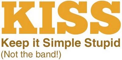
So, first and foremost, you've got to formulate a great strategy. Second of all, we're going to always kind of rely on the old KISS method, right? Keep it simple, stupid. So, in landing page design and construction, very, very important. It's all about reducing the noise, reducing the distractions, right? I don't want a deal. I don't want to go to your homepage. I don't want to be distracted by ads and flying banners and this and that. I'm just focused on what I search for, right?
So if I'm up here searching for men's watches, I just want a landing page about men's watches. I don't want any other distractions. I don't care about pants or belts or women's stuff at this point. I just want that watch. So, again, keep it simple. Basic, you want to code the page. We want the right away establish brands, logo, colors, the tone, the voice of your business. I want to make sure that where I came from, this matches. It's relevant, okay? That starts with the brand and the messaging.
I want a great photo. Draw me in. Get me interested. Maybe it's a sales price, 20% off or a Thanksgiving Day sale, and then what's the call to action? Keep it focused. What am I trying to do here? It goes back to strategy. What do you want them to do next? Fill out a contact form, buy the product, subscribe? So those are kind of the main elements that really make up a very focused and simple landing page.
One of the things, too, to talk about, I know we mention it down here is trying to keep things above the fold. You may or may not have heard of that term. That really, if you're talking about a scroll bar, if we're on a PC and we're scrolling up and down, you want to try to keep things, at least your call to action... If your main goal is to get people to fill out a contact form, you want that to be above the fold or above the scroll line. So keep that in mind when you're working out your designs or working with a marketing design firm.
Fourth we want to talk about speed, and really this should coincide with keeping it simple. Keeping it simple means there probably won't be a whole lot of really fancy interaction, jQuery, JavaScript, Flash. It's going to be pretty basic, and the images that you have, make sure that they're really slimmed down. You want this to be quick. When people, they've already searched for something, they only have a few seconds to really get what they want. They don't have patience. We know how we are. We just want to get to the action that we want, all right?
Next we want to talk about being very targeted and I think we talked about it here, and it goes back to strategy. Keeping it relevant, I search for men's watches, great. I come to a landing page. It's a detailed page. Maybe it's in your shopping cart. It's all about those watches. So let me choose the brand I want. Maybe it's a Fossil, and then I buy it right there. I'm happy. Good, you gave me what I look for.
Then we want to talk about the layout, being very simple. Again, few elements, you don't want too many distractions. Some people say, "Don't have any navigation elements at all." I don't know. I guess it depends on a product. I don't know if I agree or disagree with that. You don't want too many distractions, but depending on the sales cycle, the type of product or service you're offering, you might have people that, they're not going to make a decision right here.
Again, you want it focused, but they might leave. They'll come back later. They'll go visit some other pages on your site, and they may come back to this page. But again, you just want the layout to be simple, above the fold, and keep it very targeted.
Last, but not least, certainly not least is test, test, test. You'll see this. If you do a search for this topic, or pretty much anything in terms of online marketing, it's all about testing. That's really - yeah, you might be a great web design firm, the best marketer out there, and you've read, you've done all the research, you've read everything, and you know how to implement a pretty good, solid foundation. But until you know your audience, until you start testing, that's when you're really going to make a very focused and great campaign, and that's where the ROI is going to continue to go up, up, up.
So even testing small, little things, changing this Buy button to Go or Shop, just the language of the button, the color of the button, the actual location of the button. Small, little iterations that you can make are going to really make the campaign a lot more solid. So this is really how to create a great landing page.
by Dave Crader
Ever had your content stolen? It recently happened to us and we certainly did not appreciate it. We spend hours writing well-researched original articles because that’s what our readers deserve. You won’t find any rewriting here. The downside to this, as we recently discovered, is becoming a target for copyright infringement. Luckily, we were able to get the copied content removed in this case, but I doubt it will always be so easy. In this post we’ll go over a few options you have if this ever happens to you, and we’ll help you identify duplicate content on your own site that you may not even know existed.
There are a lot of misconceptions about Google’s duplicate content penalty, so let me explain the basics before we dive in.
A lot of duplicate content is created by scraper websites known as ‘autoblogs.’ Autoblogs are set-up by low-life scumbags who don’t have the creative skill to write their own material. These autoblogs are configured to scrape your website and steal your content almost instantly after you’ve posted it. This confuses search engine spiders because they don’t know which site is the source of the original content. If the spiders crawl the autoblog before crawling your website they will think the autoblog is the original source and you are the copier. If the spiders crawl your content before crawling the autoblog, you should be safe from penalties. It’s not as clean cut as that, but that’s the general idea. Either way, it’s worth your time to proactively pursue content thieves just to be safe.
I was doing some research for our new mobile app service page and stumbled across an article that looked strikingly similar to David’s stellar mobile website blog post from back in June. I ran David’s article through copyscape.com, a free online plagiarism checker, and was surprised to find not just one infringer, but two. I immediately sent a friendly yet direct e-mail to the website owners in hopes of getting the copied content removed.
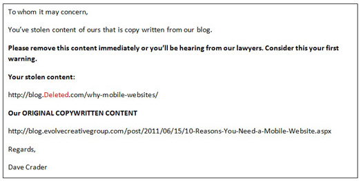
This is one of the e-mails I received back:
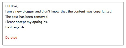
I won’t expose this individual since he complied, but it’s interesting that he didn’t know about basic copyright infringement laws. When a tangible idea is shared with at least one other person it becomes protected under U.S. copyright law. A tangible idea can be defined as any idea that is spoken or written. It really does not matter if ‘Copyright ©’ appears next to the idea or not. ‘Copyright ©’ is just a way to warn people that the idea is protected. Like any law, there are various odd exceptions that come into play, but I’ll leave those to the U.S. Copyright Office to explain. The other infringing website owner did not respond to my e-mail, but the page was also removed promptly.
I’ve never had to go straight to the hosting provider, but Google recommends it on its duplicate content help page. I didn’t know hosting providers were required to accommodate such requests, but if they are, it seems like this would be a very effective method.
You can always have your lawyers write up an official cease and desist letter if you’d like, but this is usually pretty expensive. I’d go with option one or two before heading down this path.
If you can’t get a hold of anyone you can always file a request for Google to remove the infringing page from its search results. The copied content will remain, but no one will be able to find it in search results. This will also remove the risk of any duplicate content penalties Google may have assigned to your website.
On-site duplicate content is very common. It’s arguably more dangerous than off-site duplication because precious link juice is being spread thin in multiple directions. Off-site duplication doesn’t split link juice, it just tells search engines not to give any juice to the copied version.
For example, let’s take a look at Gojo.com. Gojo’s® homepage is splitting link juice in 6 directions causing canonicalization issues. We know this because each of the following URLs displays the exact same homepage content.
• http://gojo.com/
• http://www.gojo.com/default.asp
• http://www.gojo.com/default.aspx
• http://gojo.com/default.aspx
• http://gojo.com/default.asp
• http://www.gojo.com/
Google gets confused by this because it doesn’t know which URL is the primary version that Gojo would like to rank in search. If Google doesn’t know which version is the primary, it makes a guess based on backlinks and other factors.
The split has also caused a link equity problem. For example,
http://gojo.com/ - has 20 backlinks.
www.gojo.com - has 891 backlinks.
Google assumes www.gojo.com is the primary version because of the backlinks, but that doesn’t necessarily fix the problem. The company is still missing out on some precious link juice from the 20 people who linked to http://gojo.com instead of www.gojo.com. All of these problems can be easily fixed with a 301 redirect or a rel=”canonical” attribute specifying one primary version of the URL.
A rel=”canonical” attribute will only redirect search engine spiders, not users.
A 301 redirect will redirect both search engine spiders and users.
Looking at the Title tags of a website is an easy way to detect duplicate content issues. You can find duplicate title tags in the Diagnostic section of Google webmaster tools. If you don’t have Google Webmaster Tools set up you can use Xenu Link Sleuth instead (Mac users will need to use Screaming Frog).
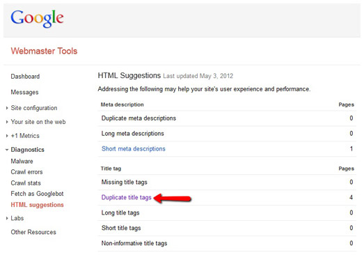
Two pages that have the same title tag often have the same content as well. To fix this, you should apply a 301 or rel=”canonical” attribute to specify a primary version. If one page has accrued more backlinks than the other, I’d recommend choosing the page with backlinks as the primary.
A lot of webmasters offer visitors a ‘print friendly view’ of their website’s pages. This is great for users, but bad for search engines because two pages with the exact same content will exist on the website. The rel=”canonical” attribute can be used in this situation because it will eliminate the duplicate content issue while still allowing users to access the print friendly page. If a 301 is used the user would be redirected back to the same page that he/she is currently on. The rel=”canonical” attribute was actually invented for this very reason. Here at Evolve, we avoid this issue completely by using print friendly style sheets and CSS. These style sheets use a different set of css properties for when a browser attempts to print a page. This creates a print friendly version of the page without needing a separate URL. Smashing Magazine has a great tutorial for accomplishing this.
Search engines hate duplicate content because they don’t know which version to show in search results. They’re already dealing with over a trillion web pages - why make their job even harder? If you think you may have some duplicate content issues, just give us a call at 234-571-1943 for some help.
When designing a website, one of the very first things designers need to consider is the site's audience. Are they younger or older? Tech-savvy or not so much? Men or women? Affluent or middle class? To build a successful website, all of these questions need to not only be researched thoroughly, but should also be on the designer's mind through every step of the design process.
It's easy to overlook the fact that not all Web users are as tech savvy as the designer behind the scenes. Usability is crucial on the Web, especially when designing for a unique user base that can range from young children to elderly adults. Today, we'll focus on what to keep in mind when designing a website for older users.
With many of today's top Web designers being young, creative minds eager to push the boundaries of design, it's all too easy to overlook the user's needs. This is especially easy to do with websites whose audience may include one of the largest generations in America – the Baby Boomers. Currently ranging in age from 48-66, Baby Boomers are responsible for well over half of all consumer purchases made in the U.S.
With such a huge consumer base out there, the amount of websites that disregard this demographic is staggering. Of course, designing for an older crowd can be a true challenge. To help out, I've put together a list of six guidelines to follow in your next quest to design an easy-to-use site for this unique generation.
Older users are used to connecting with people, not machines. Your Web design needs to have a sense of warmth and humanity in order to appeal to this demographic. Colors, photos and font choices can all have this effect on users. Soft, muted color palettes and images of happy, satisfied people similar to the user's age, gender, etc. can all be used to help achieve a positive emotional response.
When designing a site with an audience of older users, this isn't the time to pull out your fancy CSS tricks and Flash animations. These flashy, moving elements tend to confuse and distract older users, and can often end up looking more like advertisements than content. Keep the organization familiar and the text easy to read. Online users, young or old, don't spend time reading large chunks of text, but rather scan for important information. Breaking up written content with large titles and section headings is a good way to let your users digest all that information.
The design process can easily get hung up on the big, visual elements. These often require small, artsy fonts many users struggle to read. Since the textual information is often the most important content on a site, make it large and in charge, or give the users some control over it. Jakob Nielson suggests designers consider adding a button that loads an alternate stylesheet with larger font sizes since that function can be hard to find in the browser itself.
Along with text size, color and contrast play a huge role in both readability and usability. Keep the contrast high (black text on a white background reads best) so your users don't have to strain their eyes. These rules are especially important for links.
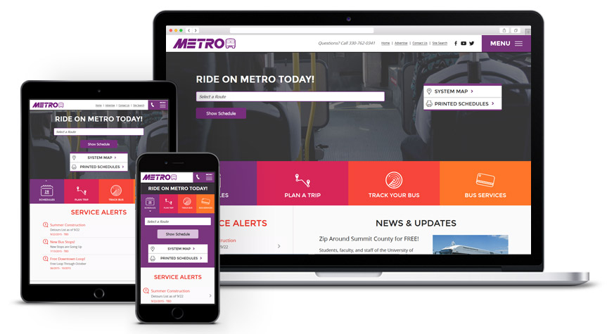
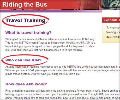
Here at Evolve, we always keep core usability rules in mind. A good example of breaking up large amounts of text can be found on Akron METRO's site, as seen below.
Most sites work to drive users to perform a specific action. Whether that means uncovering information, purchasing a product or paying a bill, the important links and buttons that need to be clicked must be emphasized. For text links, make sure the font is large enough to read, as well as maintaining extra spacing between links so users don't accidentally click the wrong one. Also, be sure to visually distinguish between visited links and those that have not yet been clicked. Always let your user know where they are and where they've been.
Clickable icons and buttons also need to be big and appear clickable. With older users, be careful with dropdown menus and other types of "moving" navigation, as they can be difficult to interact with.
Nielson says, "Search is the user's lifeline when navigation fails." This is absolutely true, and a fallback for many users, so it's important to provide an obvious search function that's flexible enough to accommodate plural and past tense words, phrases and common misspellings. Not finding what you're looking for on a site can be a big frustration, especially for older users, so designers and developers need to work diligently to avoid this by facilitating good functionality and effective design.
This global rule is golden. When it comes to the Web, there are several key elements of a site that have come to earn their keep. Global navigation, search bars and "Contact Us" links are all examples of elements whose style and placement should not be toyed with. Where do most users expect to find the search bar? In the upper right hand corner. The "Contact Us" link? If not included in the global navigation, it should be at the very top or very bottom of the page. And how about that global navigation? Always at the top of the page. Sticking to these principles that have slowly formed over the course of Web history is an integral part of designing a usable website. These rules apply to all user demographics, but are especially important when it comes to designing for an older crowd.
When designing a website, no matter the audience, the above elements are vital for a smooth, error-free user experience. With older users, these basic rules are even more important to ensure the user moves effortlessly through tasks on the site and isn't walking away frustrated. The challenge of designing for a unique user base is one that every Web designer will face in his or her career – it's just a matter of focusing on the user's needs and keeping the basic rules in mind.
With a new year comes exciting new possibilities. These often come in the form of resolutions, but here at Evolve, we took a stab at predicting how several of the key aspects of the Web world might change in 2012. Take a look at our thoughts on what the next big thing might be. Also, check out the reference links for even more insight into the world of possibilities for 2012.
Google will continue to own this space. Their blended results (local search, video, social, news and images) will continue to change throughout the course of the year, and it will grow as a local search tool. More small- to mid-size companies will recognize the importance and value of paying for professional SEO support.
Small businesses will try their hand at this, but struggle without some third-party support. Medium- to large-size businesses, however, will start paying attention to social metrics and succeed. New social start-ups will emerge, but we'll have to wait and see what the next big thing is going to be. Facebook, the most popular social network of 2011, will continue to dominate the social space with more acquisitions, enhancements and older users flocking to this platform. Some believe Twitter will be used for news feeds more than conversation, and will start to die off. Others who disagree note the many users that complain Facebook is clogged and annoying, while Twitter is quick and easy. Twitter will need to be watched closely.
This will continue to be one the best forms of up-sell, cross-sell and lead generation marketing tactics in 2012. The big change will be in mobile email marketing, as it's growing rapidly. Email marketers will need to pay closer attention to mobile going forward, and should keep it in mind when they design and strategize for this platform.
PPC has historically been owned by Google, who recently blurred the lines between what is a "paid ad" and what's "not." Our usability testing has revealed many users can't tell the difference. In either case, Facebook PPC will challenge the Google giant in 2012, and will become more popular for companies that decide it makes sense to try out.
Many marketers still have no idea what this is and what it does, but the industry is hoping to see more marketers budgeting for this. With more technology and interaction being integrated into websites, the importance and popularity of this service will surely grow. We may still be a couple of years away though.
Ecommerce will continue to grow with more product-driven business models. Mobile shopping will emerge as a viable platform, and social shopping will also grow for consumer markets.
We're already seeing a shift in analytics with mobile browsing gaining traction, but it'll continue to be a hard sell to upper-management. This should be the year for mobile, but whether that holds true is still to be determined.
This one's a no-brainer. Apps have become the hottest new trend, and will continue their dominance this coming year. Costs will determine who can play in this space, and the target audience will determine what platform to invest in. iPhone? iPad? Android? All of the above? Regardless of the choices made, the staggering popularity and capability of this service will provide plenty of fuel for 2012.
With the growth in sales over the holidays, tablets will be a viable platform for Web development this coming year. Marketers and designers will need to start paying closer to attention to their users and how their websites perform, look and interact on theses mobile browsing devices.
Firefox will lose some additional ground to Chrome, which will grow in popularity among younger demographics. Safari will continue to hang on with the Apple OS backing it, and IE will gain more traction with the introduction of the new Windows 8 operating system. We may even see the death of IE7 (at least our industry hopes so).
Each year the amount of video viewed online continues to grow. As mobile devices get savvier with serving up optimized videos, we'll start to see videos on almost every website.
Mobile web visitors want information quickly without having to pinch and zoom to find it. It can add an extra layer of frustration as some devices don't allow for users to zoom at all. A perfect mobile website has larger text and links readable on all mobile phones, not just smart phones. It's also an opportunity to condense content where appropriate, so your users can have the best experience possible.
This is probably the most important reason to consider a mobile website. Considering you're dealing with a device that doesn't have the memory or screen size of a desktop computer, your website needs to be optimized to display correctly on a phone. Imagine a user trying to access your current desktop site on a mobile device. Your current layout may look completely discombobulated, or the site may not even load at all. If your site makes use of Flash animations to convey important content, it won't be visible.
A mobile website taking longer than 4 seconds to load will lose 25 percent of its visitors, according to a few different recent studies. Those frustrated users could be customers possibly taking their business elsewhere. When designing a mobile website, large pictures and fancy animations just aren't going to work. Mobile Web visitors are usually on the go, and you need to get them the information they need as quickly as possible.
43.5 million people used their mobile phones to check email in 2010 – a 40 percent increase from 2009. When customers open your newsletter on their mobile phones, will they be able to click through to your website? Will it even display at all? With the rising number of Internet-enabled mobile phones, this could cause severe problems for your email marketing campaigns.
21.3 million smartphones shipped in 2008, 54.5 million shipped in 2009 and 100.9 million shipped in 2010, according to research firm IDC. That's an 80 million increase in only 2 years. To top it off, smartphones outshipped PCs by 9 million units last year. There's clearly a trend forming.
Two-thirds of those polled in a study by Adobe said they prefer to shop via mobile websites rather than mobile applications. Games, music and social media were the only categories users would rather navigate with an app over a mobile website.
SMS (text), mobile applications and mobile websites are the three most popular marketing mediums in a mobile marketing strategy. But there are some potential downfalls. SMS marketing is intrusive, and could annoy potential customers. Mobile applications are costly, and must be specifically tailored for each mobile operating system (iPhone, Android, Blackberry, etc.). However, mobile websites function on all mobile operating systems without having to download any software. Specific studies have shown Fortune 500 companies are much more interested in having a mobile website than pursuing any other mobile marketing medium.
By 2014, Gartner Research predicts 90 percent of the world will own a mobile phone capable of accessing the Internet. That would equate to over 6.5 billion mobile connections worldwide. Are you ready to keep up with your competitors and get a slice of this emerging market?
According to a study by ATG and Oracle, roughly 30 percent of U.S. consumers made at least one mobile purchase in 2010. That's a 123 percent increase from the same time period in 2009. Younger generations (18-34) are even more likely to make purchases from mobile phones.
According to Juniper Research, 300 million people will be redeeming coupons on their mobile phones worldwide in 2014. A mobile website can be optimized to place your coupon at the top of your mobile homepage. The ease of obtaining it will result in more redemptions and increased sales.
Ignoring the need for a mobile website isn't much different than willingly handing your competitors a serious advantage over you. Smartphones are the future of online Internet access. Some are even calling it Web 3.0. Mobile websites engage visitors and give them an overall better experience with your website. We use our 4D process to develop fast, intuitive and user-friendly mobile websites that provide visitors with exactly what they're looking for quickly and easily. We want to impress everyone that visits your website regardless of how they get there. Having an amazing website without a mobile counterpart is like having an amazing product without a store. Both need to complement each other to be successful.
When it comes to writing great website copy, there's a lot to cover, but in lieu of the main lesson here, I'll keep it short and sweet.
The well-known KISS adage holds true more than ever on the Web. Let's face it. Web users are impatient, and grow increasingly so as the years pass. If you're lucky (and I mean really lucky), you'll get 3-8 seconds to grab their attention. That's because users don't read Web pages word-by-word. They scan.
If you perform a simple usability test, watch over someone's shoulder as they browse the Web or pay attention to your own personal habits, it's pretty obvious we've evolved into scanners. We're impatient, and ready to move on. We want the meat, and want it as soon as humanly possible. As a result, important website copy needs to hit hard and hit fast. It needs to be scannable, and there are a few good ways to accomplish this:
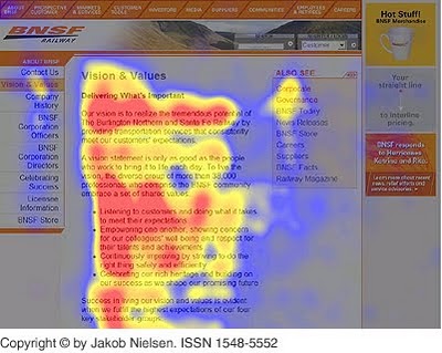 If you look at Jakob Nielsen's article on how we read Web copy, you'll see eyetracking visualizations show users often read Web pages in an F-shaped pattern – two horizontal stripes followed by a vertical one.
F – for fast. That's how users consume your precious content. In a few seconds, their eyes move at amazing speeds across your website's words in a pattern that's very different from what you learned in school. Need proof? Check out some eyetracking study heat maps.
As the Internet has become more a part of our everyday life, some new words have made their way into our vernacular that we don't quite know what to do with in our copy. How should we spell them? What's commonplace knowledge and what isn't?
A great reference book every copywriter should have is the "Associated Press Stylebook." Stylebooks are generally released on an annual basis, and the AP's now has a dedicated section for style rules to use for Web terminology. Have you noticed how I capitalize "Web" and "Internet," but not "website?" I can thank my stylebook for that.
Regardless of what role we play in the Web design process, one thing we all need to be aware of is search engine optimization. For copywriters, it's very important to keep in mind that search engines are sifting through a website's content and looking for keywords and phrases relevant to that business. So, before you commit a keystroke to your site, make sure you start with a keyword strategy.
Work with your online marketing team (or study your site's analytics if you don't have one) to determine what keywords are important to for search listing rankings, then try to integrate these as best as possible into the content of your site. The copy should still be relevant and make sense to a human, but tossing in relevant keywords when it makes sense will help with your search engine placement.