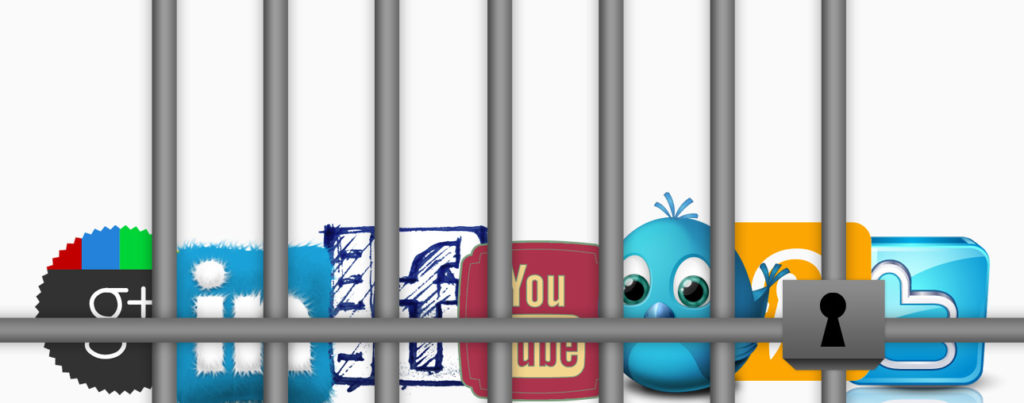
I was recently asked to create some unique social icons for a client – rounded-corner buttons with a 3D look and subtle gradients. Knowing Twitter had updated its branding several times in the last year or so, I checked the website’s branding section to be sure I had the right logo. I quickly realized that everything I was about to design was technically not allowed.
Do’s and Don’ts
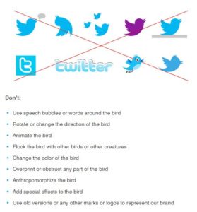
I’m well aware that all major brands have usage guidelines (and if they don’t, they should), but I was surprised to find in Twitter’s guidelines of what not to do, plenty of examples of things I see on the Web on a daily basis: Adding graphics (like speech bubbles) to the bird, using a different bird to represent Twitter and most commonly, changing the color of the Twitter icon (or any other social media icon for that matter) to match a custom color scheme. These are all definite “don’ts,” according to Twitter.
After some more digging, I found that most of the major social media platforms—Twitter, Facebook, YouTube, LinkedIn and Google+—have similarly strict brand guidelines. Take Facebook’s General Do’s and Don’ts for example.
![]() They have one simple “don’t” when it comes to their minimal “f” logo: “Don't modify the ‘f’ logo in any way, such as by changing the design or color.”
They have one simple “don’t” when it comes to their minimal “f” logo: “Don't modify the ‘f’ logo in any way, such as by changing the design or color.”
As a Web designer, I read that and thought, “Not fair! I wanted to use the ‘f’ in an orange circle to match the look of my client’s website”. But after a moment, I asked myself this: Why do we feel we should be allowed to alter the branding of social media icons to suit our design needs? Most designers wouldn’t dream of doing that to any other logo, aside from maybe making it grayscale.
Facebook has a helpful FAQs section that spells it out for anyone questioning the reasoning behind its rules.
For example: Why does Facebook need rules about how to use its brand assets?
These rules are intended to promote consistent use of the Facebook brand. This makes it easier for people to instantly recognize references to Facebook and prevents consumer confusion. These guidelines also help protect company trademarks.
What does Facebook do if people misuse its brand assets?
Facebook dedicates substantial resources to the development and protection of its intellectual property. In addition to seeking registration of its trademarks and logos around the world, Facebook enforces its rights against people who misuse its trademarks.
If the above statements were made about any other big brand, like Coke for example, no one would blink an eye. It’s only because we’re talking about logos and icons displayed over and over on the Web that we start to feel we can manipulate them to meet our aesthetic needs.
Why All the Fuss?
Why do we think of social media platforms so differently when it comes to their branding? I believe it’s because we think of them as our own. MY Twitter, MY Facebook, MY LinkedIn … and the list goes on. These sites and apps have become so commonplace for so many of us that we feel they’re our own personal pages, when really, we’re just using the technology of these platforms for personal use. At the end of the day, social media platforms are owned by companies that own established brands. They simply allow us to use their technology.
Now with all of that said, I seriously doubt Twitter, Facebook or Google+ are going to slam you with a lawsuit if you make their logos pink on your modest portfolio site. A quick glance at big brand websites, as well as design and technology blogs, showed that many of these high profile sites are technically breaking the rules. In my opinion, it’s a matter of respect. Whenever possible, adhere to the guidelines. Users see these icons constantly—it’s highly unlikely they’ll be offended if the colors “clash” with your site design. Now, if the colors of these icons just won’t cut it for your design, most of the aforementioned brands have black or white options that are perfectly acceptable. Basically, if you’re going to change the icons, change them only when necessary and as little as possible.
Brand Guides for popular social media platforms & quick facts about each:
- Twitter – When using the bird with other logos and graphic elements, maintain a safety space that equals 200% the size of the square around the bird.
- Facebook – You may not present Facebook in a way that makes it the most distinctive or prominent feature of what you’re creating.
- YouTube – When using the standard YouTube logo in a social media lineup, you may only make the logo a link, if the destination URL is a YouTube channel.
- Pinterest – Pinterest does not allow you to rotate its script logo. The logo MUST remain horizontal.