Let's step away from our computers for a moment and go for a quick, imaginary walk. I'll even let you pick where. The mall? A park? Downtown?
Take your pick, and then take a second and look around. I'll bet you can't make it 50 feet without running into someone using a mobile device of some kind.
You know what? I'll do you one better. I'll bet you about nine out of every 10 people you're seeing have one tucked away somewhere.
I'd say it's a pretty safe bet. According to the Pew Research Center's Internet and American Life Project, 85 percent of adults now own a mobile device and nearly 60 percent of them are using it to access the Internet. Over 30 percent have a tablet or e-reading device – with some demographic groups reporting close to 50 percent ownership.
For simplicity's sake, we won’t even get into how many American consumers own more than one device.
The point is, with that level of buy-in, it's likely that right now, one of your customers is looking at your traditional desktop website on a mobile device.
So ask yourself the following question: What is my customer seeing on a tablet or smartphone versus a competitor with a mobile or fully-responsive website?
How do mobile and responsive websites differ?
Though they essentially serve the same purpose, websites built on a mobile or responsive framework operate in different ways:
A website built with a mobile framework is essentially a reset of an existing desktop website. It's a custom, separate website (m.yoursite.com or mobile.yoursite.com) designed to provide a user with a unique and optimized smartphone Web browsing experience.
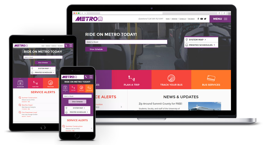
A website built with a responsive code base is an existing desktop website but completely fluid, scaling on the fly as the browser window is adjusted and providing a user with an optimal viewing experience across a wide range of devices – from the biggest desktop computers to the smallest smartphones. In short, a responsive website responds to user control.
Should my website be built on a mobile framework or a responsive one?
It depends. I know, not much of an answer, but it's the most straightforward and accurate. Why? Because a truly custom online solution is, well, custom. Unique. One-of-a-kind. Situational. A developer's preference on a specific framework should never outweigh the specific need of the client.
With that being said, it's time to consider ...
When a responsive framework is a better option
When you need consistency across multiple devices.
Let's revisit your customer, who's likely looking at your traditional desktop website on an iPhone 5. Or was it a Galaxy Note? An iPad? Amazon Kindle? Microsoft Surface?
Each of these devices has a different screen resolution – two, technically, if you consider both portrait and landscape layouts. Again, responsive designs are fluid. They allow a website to respond to the particular device accessing it, giving the user an optimized experience regardless of the platform. Screen resolution is irrelevant.
Consider these advantages as well:
Simplicity
Responsive Web design eliminates the need for a separate mobile presence, allowing the website owner to have a single site at a single URL with a single code base and set of files to be used. This makes a website significantly easier to maintain.
SEO
On June 6, 2012, Google officially said responsive Web design is its recommended configuration. As a website owner, this is what you want – the leading search engine telling you how to handle your mobile traffic. Remember, responsive Web design eliminates the need for a separate mobile presence. Using a single URL makes it easier for users to interact with, share and link to your content while helping Google's algorithms assign indexing properties for it.
Conversion
In some circumstances, an existing desktop website can be converted into a responsive one. Unless your site has somehow grown to become a slow-loading elephant over the years, there's no need to completely rebuild something you're already committed to.
Speed
If defined, designed and developed correctly, a responsive website will generally load faster. Because a responsive designer or developer has to account for both desktop computers and limited-memory devices, the best responsive websites tend to be minimal builds with fewer interactive components that never need to be taken out of play. That means in terms of pure speed, they're the cheetahs of the World Wide Web.
Despite being a relatively new option for designers and developers, responsive frameworks are a great solution, and based on existing device technology, evolving Web standards and the stance of key industry players, may not be so much solution as standard practice in a few short years. Of course, that doesn’t mean anything to the customer viewing your site on a mobile device today. That doesn't mean anything to the client without the budget to potentially overhaul or completely rebuild an existing website today.
In short, tomorrow's solution doesn't always solve today's problem. That brings us to ...
When a mobile website is a better option
When your site is heavily dependent on interactive components.
Not every company has an existing website that can provide a user with both an aesthetically-pleasing AND fully-functional experience on a mobile device. Complicated websites relying heavily on Adobe Flash animations or players, "light box" photo galleries and a number of other interactive components become borderline useless on a mobile device – most simply don’t support these elements or have the memory to run these efficiently even if they could.
Sure, a responsive code base can "hide" these elements at certain device screen widths, but the effect is somewhat deceiving. For example, while a responsive developer can prevent a homepage photo slideshow from displaying on a mobile device, there's nothing responsive coding can do to stop that slideshow from functioning – from loading the heavier backend code that makes this interactive element work. Simply put, preventing interactive elements from appearing on a device with responsive coding does nothing to prevent a complicated website from being complicated.
Again, tomorrow's solution doesn't always solve today's problem. You can't take an elephant and turn it into a cheetah. Sorry.
This is one benefit of a unique mobile website – it allows for a complete redesign, rebrand or repurpose of an existing Web presence. Because it relies on a separate code base and has a separate URL, a dedicated mobile website allows the owner to essentially "reset" the desktop version and repurpose some of the site's interactive elements while completely excluding others. This way, a website can truly become a customized mobile experience.

How Evolve Creative Group's desktop website (left) would appear on a smartphone if not for the cleaner, leaner mobile version.
Consider a few other benefits:
The Redirect
With a little backend coding, a user accessing your site with a smartphone can be automatically redirected to the mobile version of your desktop website. On paper, you'll have two URLs and two separate sites. On the Web, it will function as if you have one.
Content Control
Since a mobile website is its own entity, you can streamline your content and avoid using additional code to hide or reposition excess elements. This allows for more control over your site's appearance on a smartphone with a limited-size viewport.
A mobile website is certainly a viable and well-tested solution, and depending on how your existing desktop site is built and your level of commitment to it, may be the best fit for you. If you've made a significant investment in an interactive, component-heavy desktop website and want to maximize return without completely shunning device users, then building a separate mobile site is probably the route you should take.
The Takeaway
Regardless of the framework used to build it, a consumer's first experience with your website may be the first time a consumer experiences your brand. Take advantage of that opportunity – regardless of the device. Don't let your first impression become the last one.


